Climate Stripes
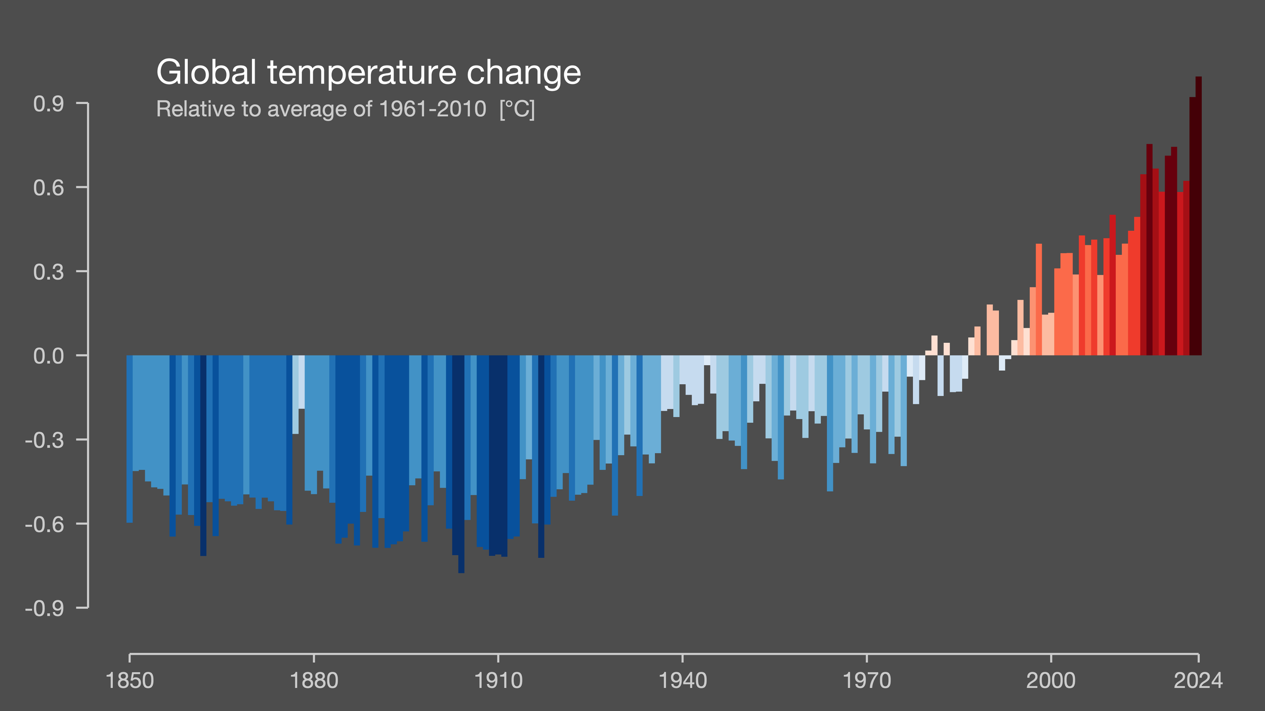
Climate stripes are a way to visualize climate change. Developed by Professor Ed Hawkins at the University of Reading in 2018, climate stripes show the progression of temperature over time through a barcode-like visual using a blue-red color scheme. The classic examples, as popularized through #showyourstripes, show annual temperature anomalies from the 1961 to 2010 mean temperature. That is, for a given location (from the global average to one country or city), the temperature is averaged for each year that the data is available, then the average of all the years 1961 to 2010 is subtracted. The resulting temperature anomalies are mapped to a color scheme where dark blue represents the most negative values, lighter blues the lesser negative numbers, white zero, and light to dark reds positive values.

Global climate stripes, as created by Ed Hawkins of the University of Reading using data from the UK Met Office. Available at https://showyourstripes.info/. The data is from 1850 to 2024.
An alternate view of the same data from the above image (same authors and sources). Here the data bars are colored the same way, but their heights vary with their values, demonstrating that the anomalies range between about -0.8 and +0.9 degrees Celsius.
The advantage of the climate stripes visualization method is its clarity. Despite the lack of quantitative labels, given western cultural blue and red associations with cold and hot (used on faucets, water fountains, etc.), the meaning is easily understood. The lack of labels can be beneficial for connecting with people who feel intimidated by science or mathematics. The extreme warming and its acceleration remain clear.
Following on from previous blog posts (What is Climate? What is Climate Change?), I use the Maryland USA data from NOAA to construct a version of warming stripes. From the monthly temperature data, I create annual mean temperatures. My data spans 1895 to 2025, and I chose 1950-1969 as the baseline temperature because I feel those two decades are when many Americans count ‘recent history’ from, e.g. the childhood years of many of the Baby Boomers.
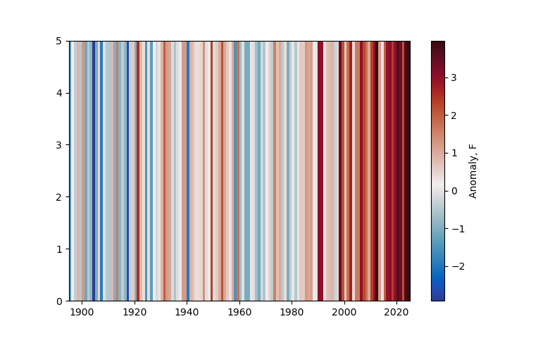
This plot shows the climate stripes for Maryland, USA, with labels for the horizontal axis in years and the colorbar in degrees Fahrenheit. The vertical axis label is not meaningful (it is inches).
The above visualization shows the same general warming trend, with the years since about 1990 being much warmer, as a whole, than any previous part of the record. There is more variation in the temperatures/colors in the middle of the record than in the global visualization. Generally, the smaller the region, the more short-term variation can show up in this type of record. I see a quasi-decadal oscillation, with the 1900s, 1960s, ~1980 being cool and the 1920s, 1940s being warm.
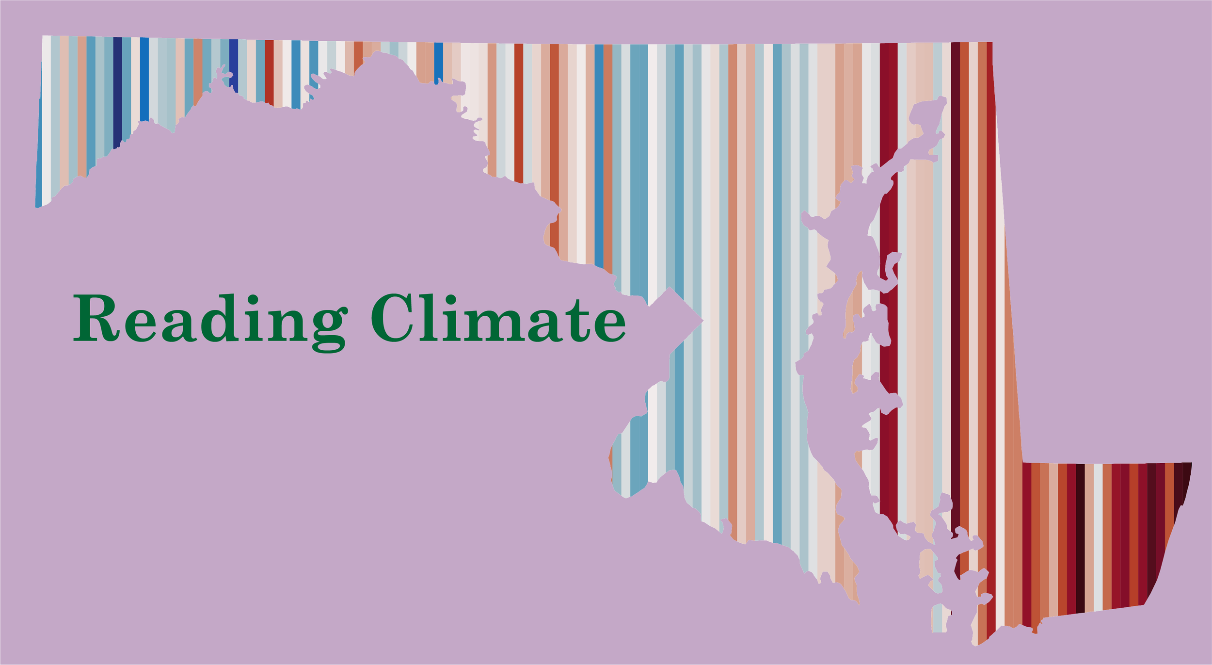
Here is another version of the visualization of Maryland through climate stripes, now as an overlay on the shape of the state of Maryland.
When the Climate Stripes website launched in 2019, more than a million graphics were downloaded within a week (here’s U. Reading’s article on the history). Many regions, countries, and cities are available as pre-made graphics to help start or continue the climate conversation. It is critical to bring everyone we can onboard to tackle the climate crisis, and good storytelling is an excellent approach. Climate stripes can help.
Individual US states are not available at https://showyourstripes.info. So, I plan to create them! We are all proud of our states and want them to be their best, and I think pride can come with critical conversations. I’m hoping to create some state pride merch with climate stripes. Likely the first piece will be postcards, so you can write to your local leaders about their responsibility to help us move forward with a thought-provoking visual. Let me know what state you’d want to see! You can email me via readingclimate2025@gmail.com or DM me through Instagram, @reading.climate.