What is Climate Change?
As a reminder, climate is the expected or typical weather in a region. So what is climate change?
Also described as climate warming, due to its association with increases in the mean surface temperature of the world, or climate weirding (thanks Dr. Katherine Hayhoe), due to the increasing variability in weather people experience, climate change is a shift in the climate. This is generally measured through changes in the mean and variability of temperature and precipitation when calculated on the scale of decades.
The IPCC (Intergovernmental Panel on Climate Change), in the Assessment Report 6 glossary, defines climate change as follows:
“A change in the state of the climate that can be identified (e.g., by using statistical tests) by changes in the mean and/or the variability of its properties and that persists for an extended period, typically decades or longer. Climate change may be due to natural internal processes or external forcings such as modulations of the solar cycles, volcanic eruptions and persistent anthropogenic changes in the composition of the atmosphere or in land use. Note that the United Nations Framework Convention on Climate Change (UNFCCC), in its Article 1, defines climate change as: ‘a change of climate which is attributed directly or indirectly to human activity that alters the composition of the global atmosphere and which is in addition to natural climate variability observed over comparable time periods’. The UNFCCC thus makes a distinction between climate change attributable to human activities altering the atmospheric composition and climate variability attributable to natural causes.”
Here, I pick up from the ‘what is climate’ post and continue analyzing some data on Maryland temperature (data is from NOAA). Please go back if you do not recall that piece.
Using monthly mean temperatures and precipitation rates of Maryland from 1895 to 2025, separated into groups for all months to see the seasonal cycle, I now separate the years into 3 groups to see if there is a change.
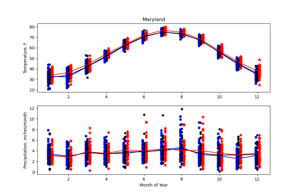
The top plot shows the mean temperature (in degrees Fahrenheit) for each month. Months are on the horizontal axis, temperature on the vertical axis, and the years are separated into 3 equal subsets of 43 years each. Blue pentagons are for 1895-1937, black stars for 1938-1981, and red stars for 1982-2025. The mean of the months in each set of years are plotted with lines of the same color.
The bottom plot is similar, but for the precipitation, in inches of rain per month. Snow is converted into the equivalent rain rate.
By separating all available data into 3 subsets, it is possible to examine whether the mean and variability of the monthly data are changing. For the temperatures, the seasonal cycle is consistent over the three timeperiods, with the months that are warmest and coolest fairly consistent— July is hottest, and December through February are coldest. The first two periods appear to have almost no change in their means, but looking at the data points shows inconsistent changes, with e.g. May having a broader range for the middle period (black) than the first period (blue), while August through December show a narrower range of temperatures in the middle period (black) than the first period (blue).
However, the latest period (red) shows a larger increase in temperatures. It is clear from the datapoints that in every month, the minimum temperature from this 43 year period is warmer than the minima of the two previous periods. The means in each month are also warmer for the latest period than both previous (see red line above both blue and black).
For precipitation, the data do not appear to show any strong trend. There is not a strong seasonal cycle in any case, and the variability does not show a strong difference between periods. Again, the variation in precipitation between years is wider than that from month to month, and there are some points that appear to be outliers both above and below others in all three periods in various months— this includes the very high rate in blue and very low rate in black for January, and the very wide ranges for June through September.
Annual means are another way to examine and visualize changes in climate. Given the lack of trends in precipitation, I will continue with only the temperature data here. By averaging the temperature in each year, it is possible to see more clearly any decadal-scale changes. Below, I plot the annual mean temperature and color it to show contrast from a mean taken over 1950-1969, which is 53.64 degrees Fahrenheit.
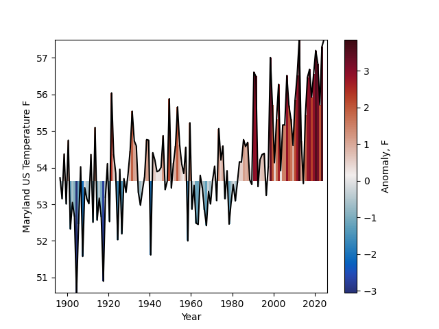
Annual mean temperature for Maryland, in black, on the y-axis, with year on the x-axis. The anomaly from the 1950-1969 mean (53.64 F) is shown in color under the line, with red indicating higher temperatures and blue cooler temperatures.
It is clear from this annual temperature plot that the temperature is rising in a long-term sense. Many of the years prior to 1930 are below the 1950-1969 mean by at least one degree, while almost all years from 1980-2025 are above that mean by at least one degree. The variability of the annual mean temperatures is fairly high throughout, with year-to-year changes typically 0.5-5 degrees Fahrenheit.
As with the previous climate post, I will close with the Koppen climate classification. The projections of the changing climate available from climate models allows for the projection of whether the climate classification will change. Koppen.earth provides images showing the future climate under different scenarios, based on the mode from up to 20 climate model’s output. Below I show the images of the US for two different scenarios, a moderate emissions scenario and a high emissions scenario. (I hope to cover greenhouse gases and emissions in the next post.)
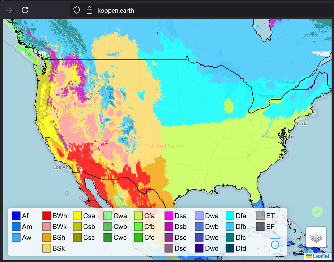
Koppen classification for 2100 under a moderate emissions scenario (SSP2-4.5). Maryland is part of the Cfa category, the same as the historical data show.
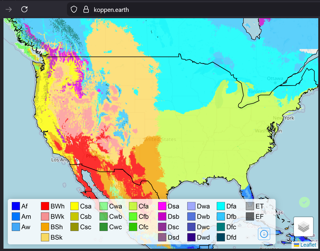
Koppen classification for 2100 under the high-emissions scenario, SSP5-8.5. Maryland is still in the Cfa category, but it is clear that the category has expanded northward significantly compared to the moderate emissions scenario and the historical categories.
That’s all for today! Thanks for reading. Let me know if you have any questions, and sign up for the newsletter (currently slated to be one monthly email) to find out about new posts and projects.